Use the numbers to improve the network
Each view answers a different question. Start with the whole network, find the weak line or place, then test one change.
Read the network in order
| Can people reach it? | In walk reach |
|---|---|
| Does the service compete with driving? | Satisfied |
| How many trips use it? | Riders / day |
| Does the service fit the demand? | Peak crowding and takt |
| What does it cost? | Daily result and Capital available |
Do not judge one number by itself. A line can reach many people but still lose them through a slow ride, a long wait, or crowding.
Start with the top bar

Click a number or its icon to open that figure. Large top-bar totals use short forms such as 2.74M. Open the card for the full count.
| Icon | Figure | What it measures |
|---|---|---|
| Person | Riders / day | Trips carried on an average weekday. An outward and return journey count as two trips. |
| Two arrows | Change lines | Trips that use more than one of your lines. These trips are included in Riders / day. |
| Walking person | In walk reach | The share of daily trips with one of your stops within walking distance of the start or destination. |
| Smiling face | Satisfied | Of the trips your network can offer, the share that competes well with driving. |
| Wallet | Daily result | Fares minus the daily service cost. A negative result needs a subsidy. |
Riders, Change lines, and In walk reach show their total and its meaning above the list.
The rider and service figures keep the last closed year's result while you plan. Finish year calculates the next exact result.
Capital available is the amount beside the plan button. It updates when you reserve or change planned work.
The small arrows show changes from the previous completed year. Hover a figure to read the amount and comparison year.
Separate reach from service quality
Walk reach says where the network is available. Satisfaction says how useful its available journeys are.
If walk reach is low, extend the network toward uncovered trips. If satisfaction is low, improve the service you already offer.
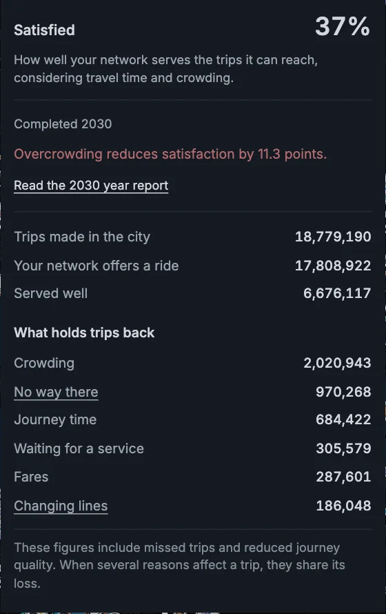
- No way there: the trip has no useful route on your lines. Add coverage or a connection.
- Journey time: the route is too slow or indirect. Use a faster or straighter corridor.
- Waiting for a service: the takt is too long when people want to travel. Run that period more often.
- Changing lines: a transfer adds too much time. Put both lines at one station or improve their takts.
- Crowding: vehicles are too full. Use more capacity or a shorter takt.
- Fares: the price makes some people choose another way to travel.
These figures include missed trips and reduced journey quality. When several reasons affect a trip, they share its loss.
Read the effect of overcrowding
Severe overcrowding reduces satisfaction strongly. The deduction depends on how much passenger travel exceeds scheduled capacity.
A short crowded section matters less than overcrowding across much of the network. The score also retains journey-time, waiting, transfer, and fare effects.
The Satisfaction card states the crowding consequence and links to the dated Year report. That report identifies the services that need work.
Earlier years keep their recorded scores. The stronger rule applies when you finish a new year. Reports identify the scoring change.
A score change across that boundary is not an ordinary service comparison. Planned timetable edits do not change the completed score.
Find the line that needs work
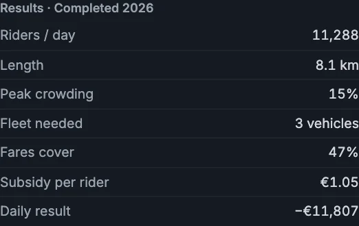
- Riders / day: trips carried by this line.
- Length: the complete distance from end to end.
- Peak crowding: the fullest point and period. Above 100% means the measured load exceeds scheduled capacity.
- Fleet needed: vehicles required by the takts you set.
- Fares cover: the share of this line's running cost paid by fares.
- Subsidy per rider: the gap between cost and fares, divided by the trips carried.
- Daily result: fares minus this line's daily running cost.
Fares cover is not a pass mark. Public transport usually needs a subsidy. Compare lines and look for an unusually high cost per rider.
A crowded line needs capacity. An almost empty line with a high subsidy needs a better corridor, a longer takt, or removal.
Opening a loaded city's line list shows the whole network. Click a line to read its card, or All lines to return.
The eye beside a line changes only its visibility on the map. Hidden lines still count in every network result.
Turn on Line loads to find the busiest sections on the map. Click a section to open its line with Full selected.
Read crowding and history in the line card
Expand Crowding along the line. Each bar shows the busiest recorded load on its section. Click a bar to show that section on the map.
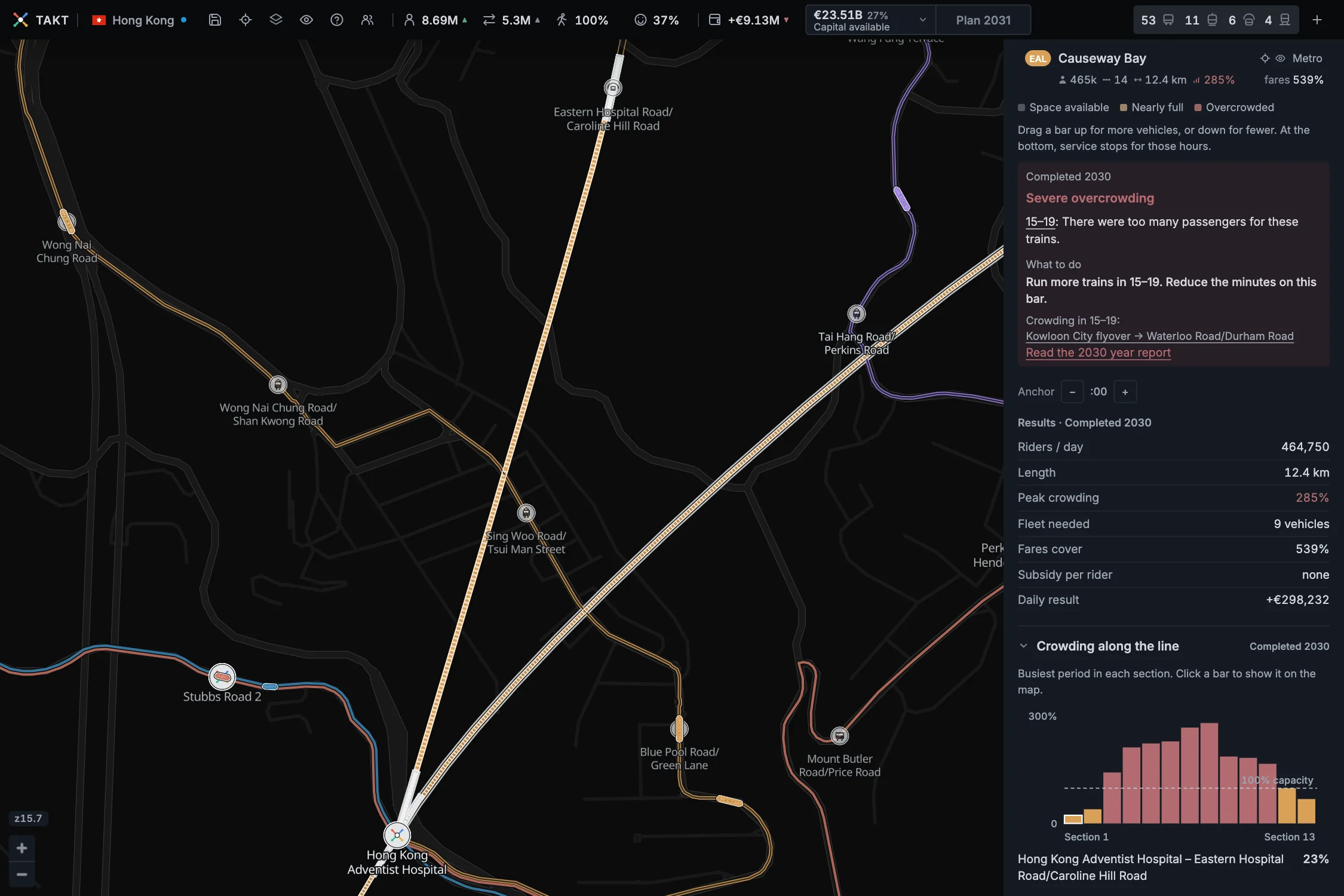
Section peaks can occur in different periods. Use the Year report when you need a matched section, hour, and direction.
Expand Ridership history to compare recorded years. Select a year to read its full passenger count.
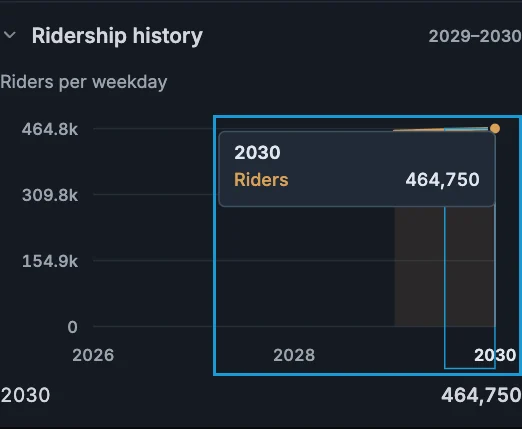
Missing old records stay unavailable. Opening the current game does not create detail for an earlier year.
Check the station behind the line
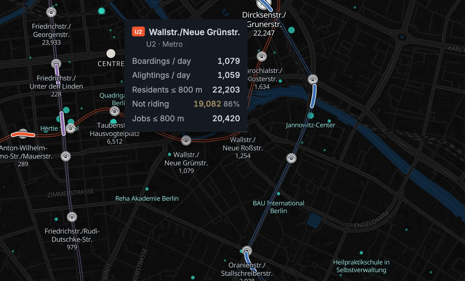
- Boardings / day: trips that enter a vehicle here.
- Alightings / day: trips that leave a vehicle here.
- Transfers / day: trips that change between lines at this station, when applicable.
- Residents and jobs: people and jobs inside this mode's walking distance.
- Not riding: residents in reach whose trips your network does not carry.
If several lines share the same physical station, the popup adds their boardings and alightings together.
A high Not riding value does not always mean the station is misplaced. The line may be too slow, indirect, infrequent, crowded, or expensive.
Read the blueprint before you add it
The blueprint shows geometry and construction facts. It lists track, stations, total price, and the share of the available capital.
The station list stays editable. Removing a station changes the map at once, and a removed terminus leaves a new end to extend.
The blueprint keeps the removal cost for built stations. Rider figures stay unchanged until the year closes.
Nothing is reserved until you add the project to this year's plan. Takt then reserves the full cost.
The project opens when you finish the year. The exact model measures the changed line after it opens.
Separate daily service from construction
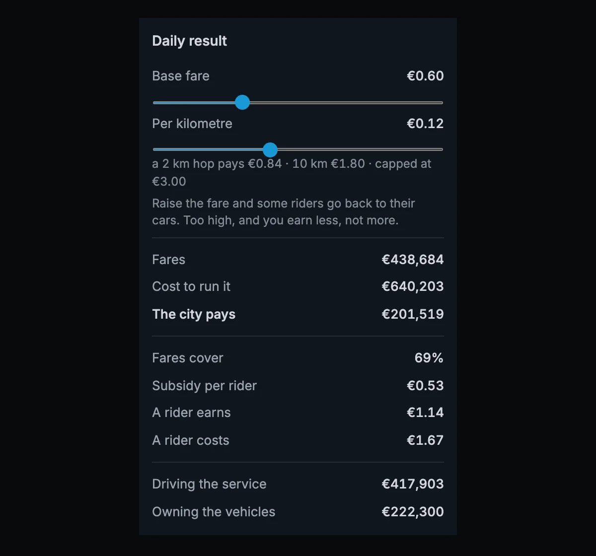
The base fare and price per kilometre form one tariff for the complete city. A change between lines does not add a second fare.
The distance charge uses the direct distance between the journey's ends. It does not charge for a detour in the route.
Higher fares earn more from each rider, but they also make some people leave.
A fare change belongs to the open year. The last exact result stays visible until you finish the year.
Driving the service changes with vehicle-kilometres. Owning the vehicles depends on the fleet needed at the busiest period.
Protect the construction programme
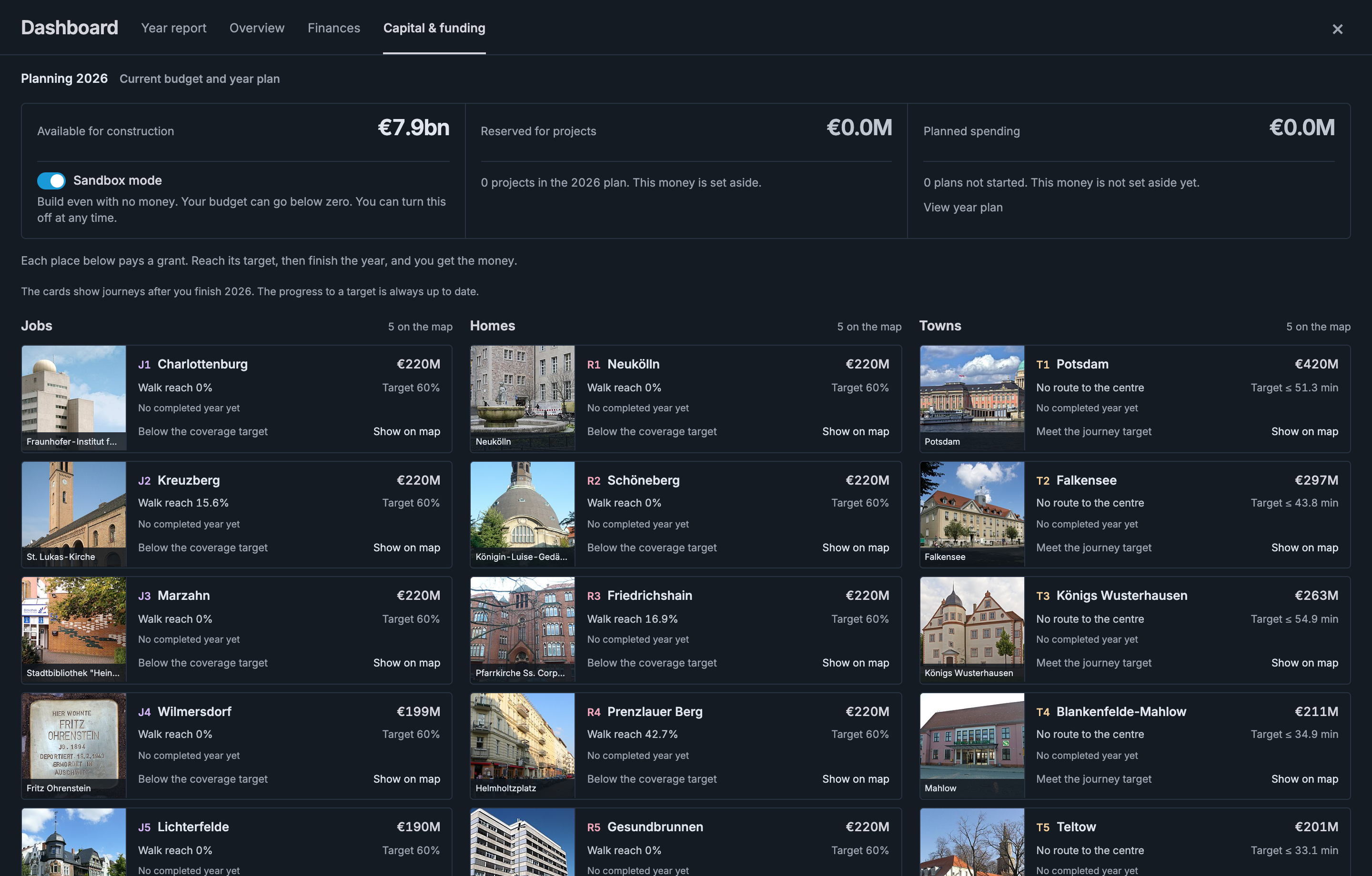
Click the capital amount to open the Dashboard. It remembers your selected view. Choose Overview to compare completed years.
The adjoining button says Plan YEAR until work is ready. It changes to Finish YEAR when you can close the year.
The year-plan card lists current construction and service changes. Open it from Finish YEAR. Completed work appears in the Year report.
Capital & funding shows available money, reserved money, and planned spending. Its five Jobs, five Homes, and five Towns match the map targets.
Click a place card to show its target on the map. Expand All remaining districts and towns, All funding details, or Payment history when you need more detail.
Operating profits and losses stay separate from building money. City funding and construction costs determine what you can build.
Sandbox mode allows construction beyond the available budget. Costs still count, and the budget can go below zero.
The Dashboard guide explains its views, the year-plan card, and their controls.
Know when a number is final
Press Finish YEAR to review the plan. Choose Confirm plans and finish YEAR to apply it and calculate the result.
Finishing a year records its exact network result. Planning does not replace that result.
The graphs show completed years only. Finish the planning year to add its results and compare them with the previous year.
A new game has no recorded trends. Overview shows the actual construction budget and the steps for the first line.
Finishing a year updates the top bar and opens the Year report. Read its findings before planning the next change.
- Read the exact network numbers from the last closed year.
- Open the weak network number and find its largest cause.
- Open the affected line or station.
- Plan one change and check its route and capital cost.
- Add the project to this year's plan, finish the year, and compare the next exact result.
Compare closed years
Open Dashboard → Overview. Choose Year and Compare with to compare two completed years.
The four headline figures show their changes and recorded trends. The charts compare network growth with income and operating costs.
Choose a measure in Network growth, or click a year on a chart. Reopening the Dashboard selects the latest completed year.
The line table compares riders, crowding, income, cost, and result. Click a line name to open its details.
Older years can lack individual line records. New completed years save those totals; the Dashboard does not invent missing history.
Existing Amsterdam games can show figures from the previous map. The message beside the numbers explains when Finish year updates them.